Tuesday, September 29, 2009

Urban Gal


So I have been knee deep in my exciting new project. I am assisting a young urban professional to help transform her home to reflect the vibrant and dynamic woman that she is. Like many single professionals, she had every intent of decorating the place once she moved in but somehow busy city life just got in the way (see my post from Sunday) .


Upon touring the space it was obvious that this was not a home that reflected the owner. The biggest issue being the serious lack of lighting and storage. But the most glaringly omission, however was the lack of personality. The homeowner fell in the trap, to which most people can relate, and bought pieces she was attracted to without the thought of how they would relate to one another, or the space as a whole. The biggest piece of advice I could give to anyone is to scheme, or plan, the entire apartment knowing exactly what you need. An overall vision, be it a folder of inspiration pictures, to an actual floor plan, which will act as your beacon. With this decorative 'road map' you can purchase as your budget allows all the while working towards the end goal. This is especially important when working on a budget because you will make mindful decisions which will not need to be replaced later because they don't fit the overall vision.


The challenge for this particular project is going to be the floor plan. The apartment is located in The Cocoa Exchange building off Wall Street and is one of the only Flatiron shaped residential buildings in New York City. Because of this, there are no right angles which make utilizing the space efficiently a serious challenge. The floor plan above is my sketch for the main living area. In coming posts, I will break down each room and discuss my plan and thought process for each space.


The most amazing side effect of this project is how it has completely, and utterly, reignited a creativity in me which I haven't felt in years. Having spent nearly a decade working for the country's top names in design, I had lost sight that style and comfort are not the benefit of the privileged few, but rather should be available to all that seek it. I am going to change this woman's life and I couldn't be happier.

Sunday, September 27, 2009

Sorry.....


So, as you know, I am new to this blogging thing. It is amazing how life gets in the way of one's best intentions. I have had every intent of posting daily when possible, but alas that has not been my reality. I took last weekend off as I was out of town, and before I knew it, it had been a week with out posting. In my defense I have been a busy little bee with clients old and new and a social life but I promise to be better in the future.


Thursday, September 17, 2009

The New Ikat?


I have been noticing a proliferation of African textiles, such as Kuba cloth, in the shelter magazines lately. Is this a foreshadowing into the demise of Ikat which has been in vogue (and over exposed) for the past few years? Kuba cloth, which originated in the African nation of Zaire (Congo) is a vegetable dyed, tightly woven textile using the strands of raffia palm leaves. The result is a coarse, yet resilient, textile traditionally used for ceremonial skirts, wall hangings, or mats for sitting and sleeping.
a
In the October issue of Elle Decor , two of the feature stories showcase the African textile. The London apartment of photographer Simon Upton is literally draped in the fabric. A consummate traveller, these represent his bounty that he has collected along the way. Although a bit overkill for my taste, it goes a long way to successfully temper the hard edges of an otherwise contemporary space. If you look closely at the image below you will notice that Ikat's evil stepsister, Suzani, makes a guest appearance.
aaaaa
The second story was the New York apartment of Anthropolgie's head antique buyer Keith Johnson. In my opinion, this was the better of the two as it's a more subtle approach and the curatorial nature is more to my liking. Their sitting room below is very chic and understated which strikes the perfect balance of modernity and antiquity. Notice the hint of Kuba in the pillow on the sofa? And the multi-tiered cocktail table from Anthony Todd never disappoints! This space really speaks to me.


So what do you think? Is Ikat on its way out? Although with Kuba cloth now available at places like this , perhaps it's 15 minutes are winding down as well.
aa
aa
All photos above from Elle Decor, except the top, which is courtesy of Pfeiffer Studios

Wednesday, September 16, 2009

Bed Hangings

David Hicks

I must admit I have only recently become a convert to the luxury that is bed hangings. I have always appreciated them visually, and have certainly done them for clients, but i have never fully grasped what its like to actually SLEEP in them. I was recently the house guest at a former client's and was lucky enough to be assigned the guest room with the bed hangings I had designed. Let me tell you what a feeling of sheer bliss that can be! The psychological comfort of being enveloped by yards and yards of material is unparalleled.

Trel Brock Photography

Of course today, bed hangings are purely aesthetic, but in the 16th century they were essential. In fact, the earliest incarnations were beds of common people seeking an additional layer of shelter from lack of insulation and a thatched roof. Canopy beds with curtains that could completely enclose the bed were also used by European noblemen for warmth and privacy, as their attendants often slept in the same room. The two images below, were produced 200 years apart however the similarities are shocking. I love the way David Hicks floated the bed in the middle of the room.

Colonial Williamsburg

David Hicks

I personally gravitate to those which are more architectural and tailored, as opposed to the overly embellished version that you often see. For me the sheer scale and drama they posses is stylish enough. This is one instance where more is not always more.

Michael Taylor

Rose Cummings

The iconic photo above is by preeminent designer Rose Cummings from the 1930's. Although technically a lit a la polonaise this was considered very avant garde at the time. Is it me or do these bed hangings bare a striking resemblance to the curtains in Miles Redd's living room?
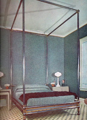
John Dickinson

I know, I know, the John Dickinson bed above is a tad off subject, but really, how fab is that?! The bed completely fills the volume of the room in what is an otherwise small room. It reminds me of my favorite canopy bed that I worked on as Design Director for 'Mr. Man'. The client's bedroom was a double height space which can be an uncomfortable scale in which to sleep. To bring it down to a more human proportion, we created "a room within a room" with a fourteen foot high canopy bed, similar to that above only with the addition of a tester and bed hangings. A truly magnificent sight. I would love to be able to share the image with you, but alas it has recently been shot for Elle Decor, so i guess you will need to wait till it hits the stand.

Tuesday, September 15, 2009

Haute Designer: Veere Grenney

Photo from Veere Grenney website

I have been completely obsessed with London based designer Veere Grenney recently. The longtime Director of the esteemed firm Colefax and Fowler has such a keen eye and daring mix of styles. He somehow manages to make contemporary pieces feel completely at home in historic traditional homes.


Australian Vogue Living, Nov/Dec 2008

His latest spread in the current issue of The World of Interiors, did not disappoint. Grenney, with help of architect Peter Inskip, transformed a dark Arts and Crafts country manor, whose original architect was none other that Edward Lutyen, into a light filled space which feels strangely modern. Grenney masterfully mixes pieces by design luminaries such as Corbusier, Charlotte Perriand, Andre Arbus and Jean Royere. Added into the mix is artwork by Donald Judd, and one of my personal favorites, Anish Kapoor.

World of Interiors, Oct 2009
On paper this sounds like a completely crazy idea to add such modern elements to this historic residence. But one must remember that at the time, the Arts and Crafts movement, WAS the modern style of choice. This movement was a reaction to the Victorian period, which the Arts and Crafts founders mocked for its lack of authenticity and its amalgamation of several styles. They wanted to strip away all the frivolity and get back to basics. What? You thought the minimalists of the 90's invented this reactionary thinking?


Australian Vogue Living, Nov/Dec 2008


His London apartment featured in the November issue of Australian Vogue Living was the very moment that my adoration moved into the realm of lust. This apartment is so sublime, understated and incredibly chic. Again he masterfully mixes styles, textures and periods to a result which I can only describe as perfection. This is one place that I could move right into without adding a thing. OK maybe one or TWO things, but certainly not much. (To see more of this fabulous apartment, check out Studio Annetta's post on the subject.)


Australian Vogue Living, Nov/Dec 2008

Monday, September 14, 2009

God Is In The Details

Mies Van Der Rohe famously said that "God is in the details" and I couldn't agree more. I love when I happen upon a detail or idea which I had never seen before. I spent Sunday afternoon with Heather Clawson of Habitually Chic . After brunch we walked through SoHo and stopped into her favorite boutique, 3.1 Phillip Lim. I had never been before, but was immediately struck by the wood slat wall that dominates the front gallery.


What at 1st glance looked like your typical, albeit ubiquitous, wooden slat wall was actually oak tongue and groove, wood flooring stacked horizontally. The alternating forms of tongue and groove created a simple, yet stylish statement.

Phillip Lim says about the design element by New York Architects, Tacklebox, "I think the humbleness of the materials we worked with…such as using oak-base-board flooring stacked up vertically, revealing perfect imperfections, creating a feeling that is dynamic and modern."
The best part was that they left the ends exposed at the corners. The simplicity and brilliance dazzled me.


To continue the theme the architects used the same flooring material to create the dressing room doors. Here however, they spaced the boards, backed with opaque glass, to allow light into the dressing room. Such an inventive way to think outside the box!


To top it all off, I even learned that they carry a mens line! It looks like my fall wardrobe is going to get a serious upgrade. Thanks Heather.

Photos from Tacklebox website, photographer not listed

Sunday, September 13, 2009

Fall Color

With the severe change in weather in New York this week my thoughts have drifted to all things fall. Autumn is my favorite time of year. It is a welcome change from the oppressive summer heat in the city, but mostly I love the changing of the leaves. Central Park becomes alive with an explosion of richly hued colors.

When it comes to interiors, Jamie Drake is not afraid of color in any form. For him, the more deeply saturated the better.

On November 4th, Doyle New York will have its annual DOYLE + DESIGN auction of Contemporary and Modern furniture and decorative arts. The highlight of the event will be the contents of the uber designers Flatiron district loft. Jamie is not known for his timid use of color, so these offerings promise to dazzle. (Click here to see more of his Technicolor apartment.)

Among the lots offered is the 1970's Intrex table above with it's polished steel base and Mulberry lacquer top. Now how's that for an entry table!

Other items include the series of 10 prints by the American color artist Gene Davis (as seen above) and a set of Edward Wormley stools with Raspberry leather cushions. The catalog is not yet online, so make sure you check back to peruse the kaleidoscope of offerings.


While you are on your way to the Doyle preview why not stop by the 59th Street-Columbus Circle MTA station to check out their latest public artwork, a posthumous piece by artist Sol LeWitt, titled "Whirls and Twirls (MTA)". This massive public piece made of colorful porcelain tile was unveiled on Thursday, which would have been the artists 82nd birthday. Something tells me Jamie would approve.

photograph courtesy of the Metropolitan Transportation Authority / Rob Wilson